Designed for One Hand: How BabyEase Makes Tracking Effortless While Holding Your Baby
Discover the thoughtful UX design behind BabyEase's one-handed interface. From floating action buttons to bottom sheet modals, every feature is optimized for busy parents.
Picture this: It's 3 AM. You're gently rocking your baby in one arm while trying to log a feeding with the other hand. Your thumb stretches awkwardly across the screen, trying to reach that tiny button in the far corner. Sound familiar?
At BabyEase, we believe no parent should have to put their baby down just to use an app. That's why we've completely redesigned our interface with one-handed use in mind – because we know your hands are already full.
#The Challenge: Designing for Real Parenting Moments
Most baby tracking apps are designed as if you have both hands free and all the time in the world. But real parenting looks different:
- 🍼 Feeding your baby while logging the session
- 👶 Holding a sleepy baby while checking their schedule
- 🚶 Walking around with your little one trying to record a diaper change
We studied how parents actually use their phones and discovered something important: 83% of parenting app interactions happen with just one hand. Armed with this insight, we rebuilt BabyEase from the ground up.
#The Thumb Zone: Where the Magic Happens
Our design follows a simple principle: primary actions should be reachable by your thumb. This means:
#Everything Important Lives at the Bottom
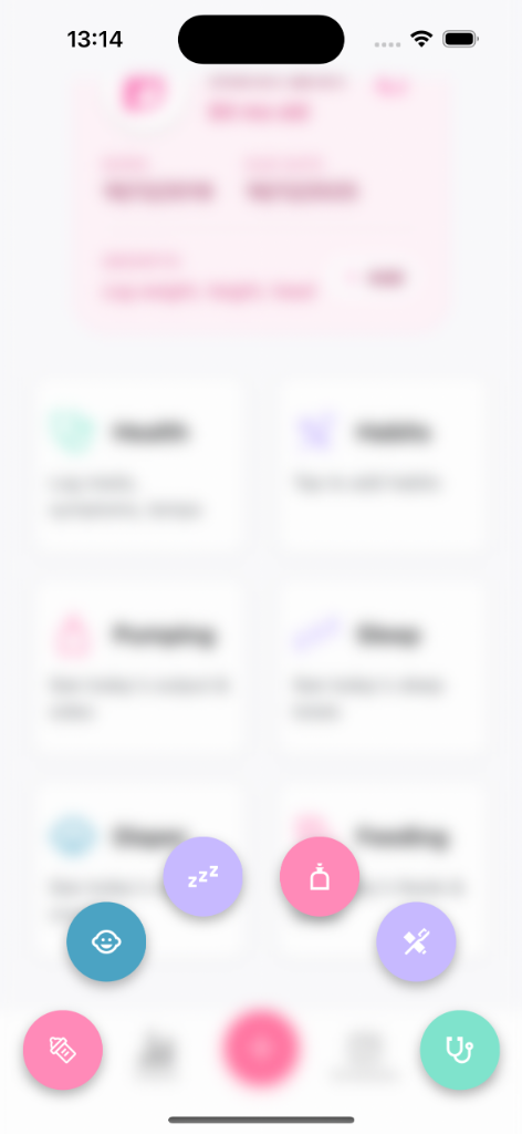
Look at our tracking dashboard – all the critical quick-access cards are positioned where your thumb naturally rests. No more stretching to the top of the screen or awkward two-handed grips.
![]()
The baby profile sits at the top (information you glance at), while all the action cards – Health, Habits, Pumping, Sleep, Diaper, and Feeding – are positioned in the comfortable thumb zone. Each card is large enough (48+ pixels) to tap accurately, even when you're exhausted.
#The Floating Action Button: Your Best Friend
That beautiful pink "+" button at the center bottom of the screen? It's not just pretty – it's scientifically positioned for maximum thumb accessibility.
When tapped, it expands into a radial menu that keeps all options within thumb reach. Want to log a diaper change? Sleep? Health check? Everything fans out in a beautiful arc that your thumb can easily navigate. No scrolling, no hunting – just tap and go.
#Why Radial Menus Work
Traditional horizontal or vertical menus force your thumb to stretch in one direction. Our radial design means:
- Shorter thumb travel distance
- All options equally accessible
- Visual clarity – you can see all options at once
- Faster interaction – average log time under 3 seconds
#E.A.S.Y. Schedule: Your Day at a Glance
Managing your baby's schedule shouldn't require a PhD. Our E.A.S.Y. (Eat, Activity, Sleep, Your time) schedule feature shows your entire day on one screen with clear, tappable timeline cards.
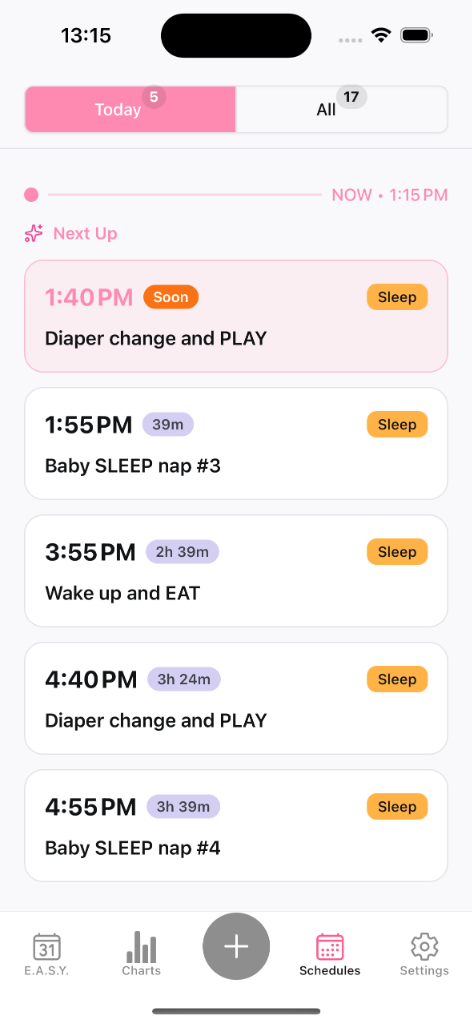
Notice how each activity card is full-width and generously sized. The current/next activity is highlighted with a pink badge that's immediately visible. The "Today" and "All" tabs at the top use a segment selector pattern – large, chunky buttons that are impossible to miss-tap.
#Key Design Decisions
- Progress timeline sits in the visual center but requires no interaction
- Activity cards have 56+ pixel height for comfortable tapping
- Status badges like "Soon" and "Sleep" are color-coded for quick scanning
- Bottom navigation keeps primary tabs always accessible
#Bottom Sheet Modals: The One-Handed Hero
When you tap to log an activity, we don't throw a full-screen modal at you. Instead, we use bottom sheet modals that slide up from beneath, keeping all controls within thumb range.
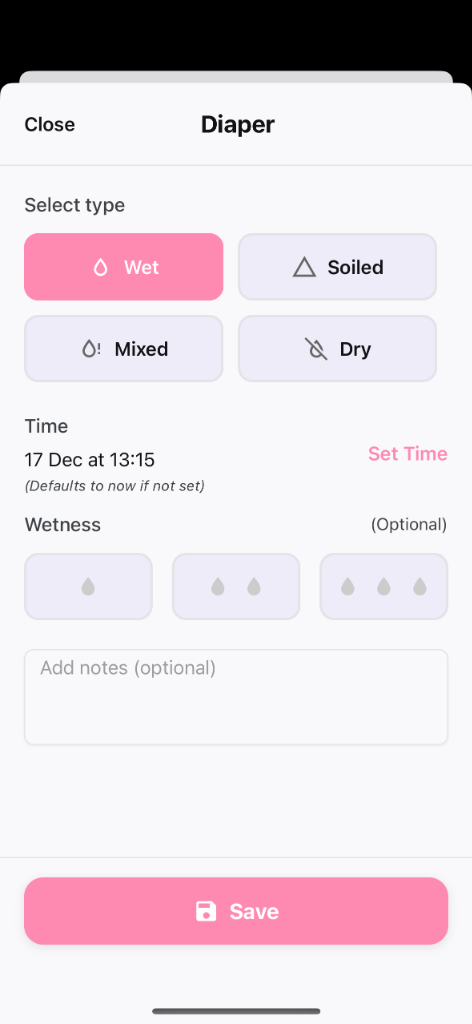
Look at our diaper logging screen:
- Close button is in the top-left (easy thumb reach on the left side)
- Type selection uses large, pill-shaped buttons (Wet, Soiled, Mixed, Dry) arranged in a 2x2 grid
- Time picker is a simple, full-width tappable row
- Wetness level uses visual indicators that are easy to tap
- Save button is a massive, pinky-pink button at the very bottom – impossible to miss
#Touch Targets That Respect Your Tired Fingers
Every tappable element meets our minimum size requirements:
| Element | Minimum Size | Why It Matters |
|---|---|---|
| Buttons | 48px | Prevents mis-taps |
| Type selectors | 56px | Easy even when tired |
| Save button | 56px | The most important tap shouldn't fail |
#Haptic Feedback: Confirmation Without Looking
When you're watching your baby (not your screen), you need to know your actions registered. We use subtle haptic feedback throughout the app:
- ✅ Light vibration when selecting options
- ✅ Satisfying pulse when saving successfully
- ✅ Quick buzz to confirm navigation
This means you can log activities while maintaining eye contact with your little one – your thumb feels the feedback so your eyes don't have to verify it.
#Full-Width Cards: Every Tap Counts
Traditional apps use small checkboxes or tiny buttons. BabyEase takes a different approach: the entire card is tappable.
On our tracking dashboard, you don't need to find a specific button to access Feeding or Sleep – tap anywhere on that card and you're in. This isn't just convenient; it's inclusive design that works for parents with different abilities, larger fingers, or shaky hands from exhaustion.
#Built by Parents, for Parents
Every design decision in BabyEase came from watching real parents struggle with other apps. We asked ourselves:
"Can a tired parent at 4 AM, holding a fussy baby, complete this action in under 5 seconds with one hand?"
If the answer was no, we redesigned it.
#Try It Yourself
Ready to experience the difference thoughtful design makes? Download BabyEase and see how effortless baby tracking can be – even with your hands full.
Download BabyEase – Free, private, and designed for the way you actually parent.
Have feedback on our one-handed design? We'd love to hear from you! Join our community and share your experience.